
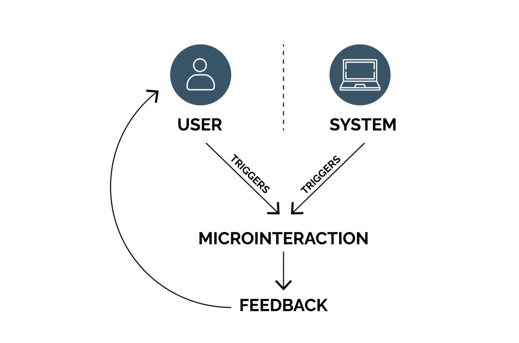
UX design must often include micro-interaction elements and ways for subtle user interactions. These components make the design more communicative and illustrative while improving its usability. However, user designers must know precisely when and where to include an active motion to enhance usability. For example, on Twitter, pulling down the screen would refresh the content. The screen slides down and bounces back, revealing a spinning wheel. This tells the user that some action has been initiated and is happening at the moment. Such subtle animations and UI micro-interactions are ingrained in our lives that their absence can be confusing. Sometimes, an animation will need to call more attention to itself, making us pause what we are doing and pay attention. For example, a confirmation window will pop up and keep blinking until we click an action button.
UX designers can create seamless experiences by using animation with some tact. In this blog, we discuss the purpose and the ways of using UI animation and motion.
Why Animation and Motion in UX?
 Animation in UX helps build mental models for users about the system’s workings and interact with it. Animations that are time-filling visual stimulations during the transition are less crucial than those that need to capture the user’s attention (like a call to action). Remember, animations need to be leveraged for usability and provide important cues about the current system status. They also signify how UI elements will behave. These serve as spatial metaphors that can be easily understood and related to the user’s location in the information space.
Feedback: Animation and motion are useful as noticeable feedback indicating an action or a condition (as recognized) in the system. For example, a navigation menu slides over the page when the user taps on the hamburger icon. The human visual system attunes to motion such that a short animation can be sensed as feedback. On the contrary, static visual feedback is ignored since users cannot sense any motion visually. Animations serve as a feedback mechanism before the user commits to action. Thus, animation or motion increases the chance of noticing feedback quickly and efficiently.
Communicating State Change: An object motion indicates the interface switch to a different state because of a mode or system status change. You can achieve this by either making the mode change noticeable; or through a conceptual metaphor depicting the mode transition. In addition to capturing mode transitions or views of data, animation and motion help communicate state changes that could go unnoticed if not triggered by user actions. For example, loading indicators depict the system is not ready to accept inputs.
Spatial Metaphors and Navigation: The structure of a complex information space can often challenge communication to users. Scanning through navigation menus, breadcrumbs, or tree diagrams to figure out the user’s location in the information hierarchy is time-consuming and needs more cognitive exercise. Animation can signal to users the direction in which they are moving within a process or information hierarchy. This adds a supplemental cue and intuitiveness while navigating through complex UI. Zooming animations help understand the direction of the user’s journey in a hierarchical design space. Zooming out decreases the detail while including more objects in a visual space while diving out of the detailing. Whereas zooming in does precisely the opposite. Likewise, slide-over animations help establish the forward or backward movement of the user within a checkout process.
Orientation: Animations prevent disorientation among users when using a new or unfamiliar design. This is especially useful for mobile UI design, where context can be lost due to the smaller screen size. Designers often use accordions, menu overlays, and anchor links in UI design. An animated cue helps tell users what they’re looking at and what they have to do next.
The Signifier of Action, Information, and Context: Animations make UI elements intuitive for users by adding context to the design, action, or information. The direction and other attributes of the animation signify what is acceptable (or not). For example, a menu or tab expanding from the bottom of the screen signals that it can be closed by pulling it down.
Types of Animation Interactions
Animation is related to the temporal behavior of interface components in real-time or non-real-time. Real-time or non-real-time events thus drive the temporal behavior of these objects.
Real-time vs. Non-real-time Motion: Real-time motion behavior involves the user’s direct interaction with the screen objects. While non-real-time means the behavior of the object is dependent on its post-interactive state. The motion is transitional and occurs after a user action. While the state of the UX object is static, its act is temporal and motion-based. When an object is in the act of being masked, it means motion is involved, which could support usability. Real-time interactions provide the ‘direct manipulation of the interface object, immediately. It means the interface behavior happens as the user is interacting with it. Non-real-time interactions take place only after the user input is provided. These give the feeling of locking the user out of the UX until the transition is completed.
Key Considerations for UX Motion and Animation
The considerations influencing the temporal behavior and usability of UX designs include:
Expectation: includes the user’s perception of the definition and behavior of an object. UX designers should focus on minimizing the gap between user expectations and actual experiences. For example, instead of the screen bouncing back and revealing a spinning wheel, nothing visually happens while the app refreshes content anyway. Instead of new content, the same content still exists because no one has made any updates in the last half hour. The app could’ve refreshed the news feed, but we’d have no way of knowing if it did or not. Based on the standard expectation, the user’s thought process is interrupted, leading to more confusion.
Continuity: covers the user flow and the ‘consistency’ of the UX. Designs can be ‘intra-continuous’ —within a scene and ‘inter-continuity’ —within a series of screens or spaces that make up the total user experience.
Narratives: define an event’s linear progression in the UX space resulting in a temporal/spatial framework. This includes a series of discreet events and reactions that form a connection throughout the user experience.
Relationships: are the temporal, spatial, and hierarchal representations between UX objects that influence user understanding and decision-making.
Speed: there is a range of milliseconds that is appropriate to animation. We can only register something happening at greater than 100 ms, like standard frame rates for movies. Slow animations frustrate the user. If we’re swiping left in Tinder, it’s great to watch someone get banished from our digital existence in slow motion, but not so slow that we can’t cover swiping another 50 potential dates within the next minute.
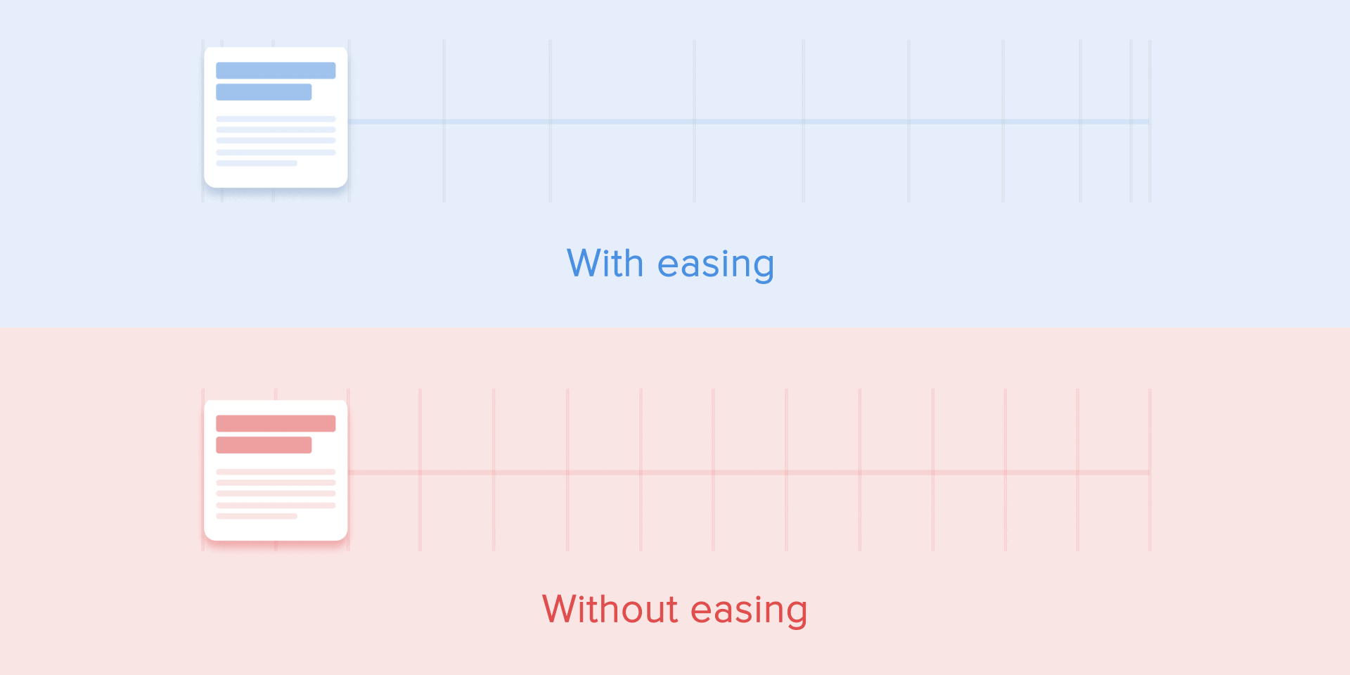
Natural Quality: Easing can be looked at as adding a natural quality to animation. Imagine a spaceship orbiting the moon and preparing to dock with the ISS. There is an initial thruster boost in which the ship accelerates to full speed. Then, there is a reverse thruster boost to bring the ship to a complete stop. If the ship were traveling at full speed, every second of that entire journey, either the ship or the ISS would explode in a real-life scenario. When depicted through a UX design, this would mean a hypothetical catastrophe or an unnatural view of a ship moving at full speed and instantly stop full speed. Likewise, it is more pleasant when things are animated based on how natural events unfold. Other examples include the slight in and out easing of a toggle switch when tapped. Or a little bounce that comes back to a stop slowly when we pull down a screen to refresh.
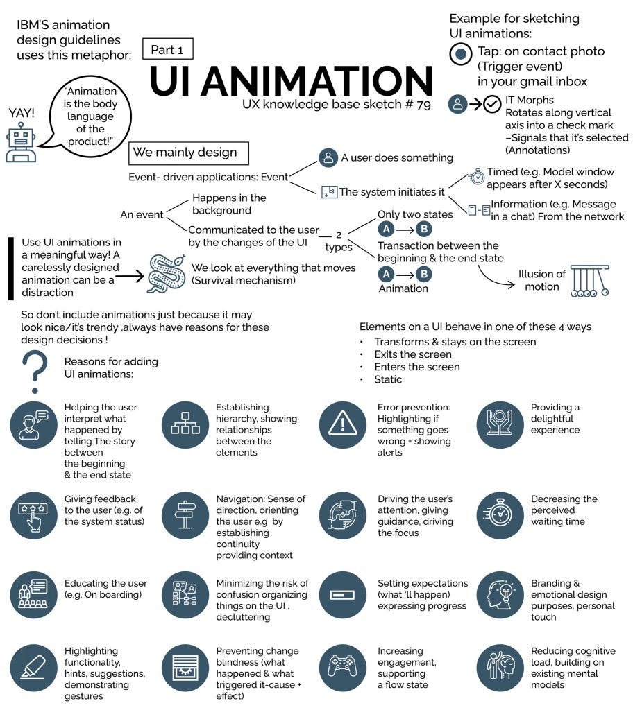
Eight Cornerstone Principles of UX Motion and Animation
UX animation is supported by these eight principles that fundamentally underscore the premises and rules of UX animation techniques. These principles are categorized based on timing, object relationship, object continuity, spatial continuity, and temporal hierarchy.
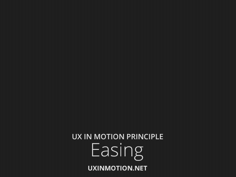
- Easing
This is also a principle that includes aligning the object behavior with user expectations during temporal events. Easing helps create and reinforce the inherent ‘naturalism’ of user experiences. It provides a sense of continuity when objects behave according to user expectations. Please refer to Easing in the previous section.
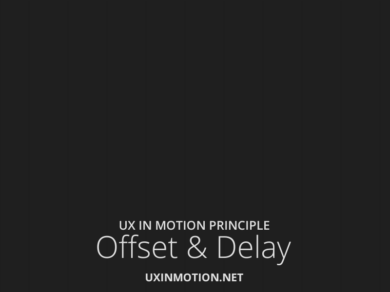
- Offset and Delay
Offset & Delay helps in designing more usable experiences. It pre-consciously prepares the user for success by providing information about the nature of the interface objects. Even before the user conceives what the interface objects are, the designer can communicate their purpose through motion which is extremely powerful. Thus, UI objects support usability through their ‘separateness.’
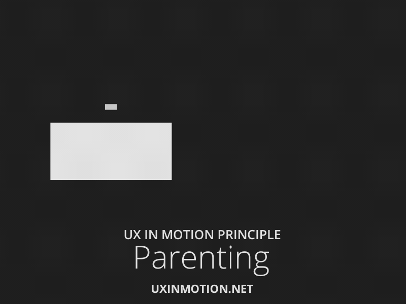
- Parenting
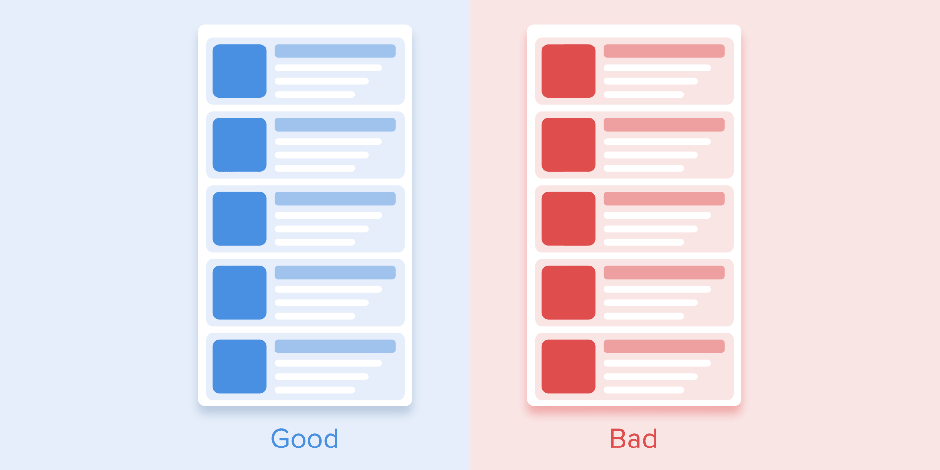
Parenting creates hierarchal relationships, both spatial and temporal, during multi-object interactions. It creates an association between UI objects in the user interface as the parent and child objects. For example, scaling or positioning the ‘child’ object is based on that of the parent object (by default). The resultant object relationships and hierarchies support usability and quick understanding among users. Designers can better coordinate temporal events while communicating the object relationships more clearly. The properties creating parent-child object synergies include Scale, Position, Opacity, Rotation, Value, Shape, Color, etc.
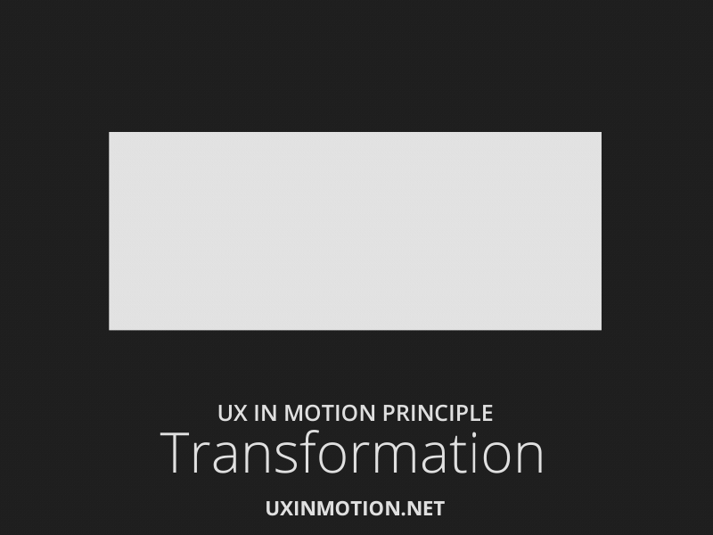
- Transformation
Transformation defines the object utility changes in the form of a continuous narrative flow state. For example, a radial progress bar appearing when the ‘submit button is clicked and then becoming a confirmation checkmark is a typical transformation example. This grabs the user’s attention, has completion, and narrates a UX design story. Transformation combines cognitively related yet separated events in UX to make it seamless and continuous. This results in better user awareness and understanding to follow through.
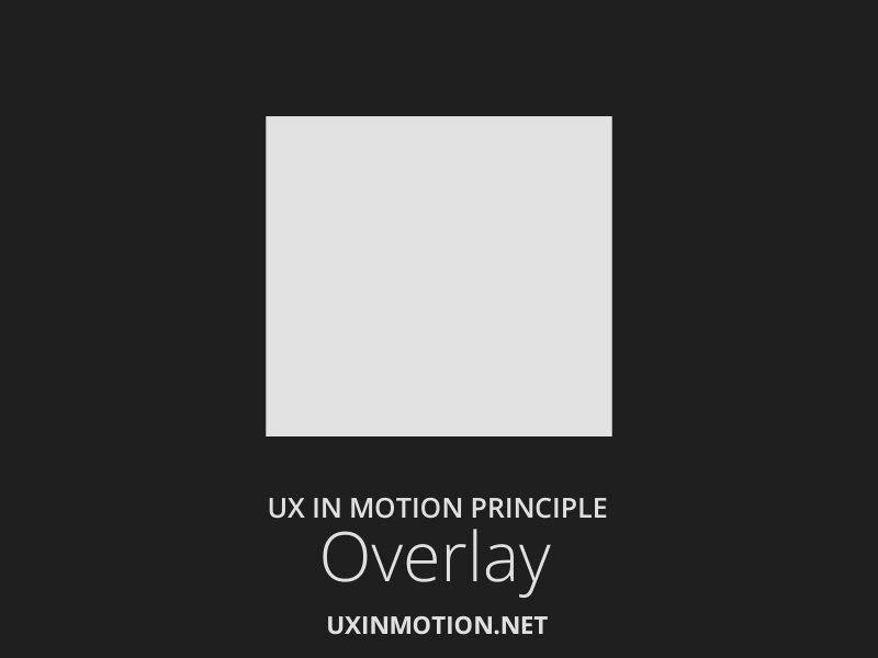
- Overlay
Overlay creates spatial object relationships in visual space where layered objects are location-dependent. Overlay allows users to leverage flatland ordering properties to overcome the shortage of non-spatial hierarchies. Overlay allows designers to communicate the location of dependent objects using motion in a non-3D space. For users, non-visible UI objects are hidden visually, cognitively, and functionally. Overlay allows designers to promote spatial orientation and communicate the relationship between ‘z-axis’ positioned layers.
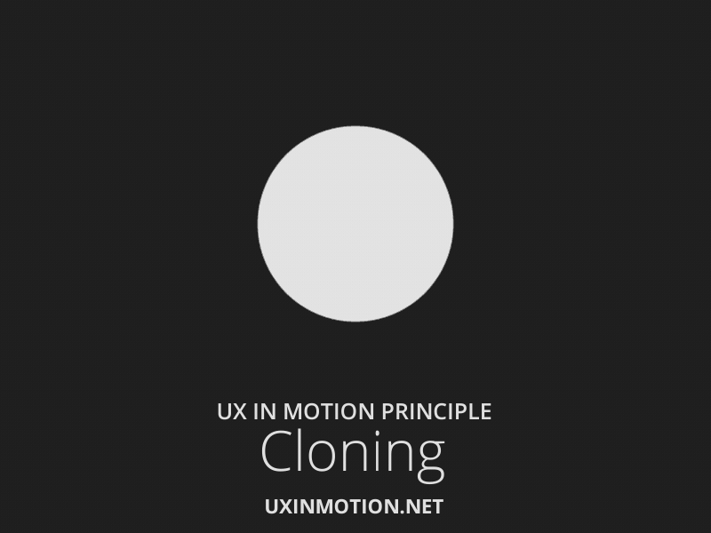
- Cloning
Cloning promotes relationship, continuity, and narrative when new objects originate and depart. As new objects are cloned from current objects in space, the narrative account for their appearance is crucial. The narrative framework of the object’s origin and departure is essential. Dimensionality, masking, cloning aid usability when producing narratives.
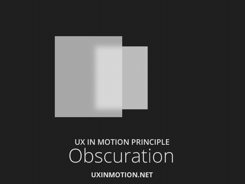
- Obscuration
Obscuration allows users in spatial orientation when considering objects or scenes absent in the primary visual hierarchy. Static and time-based obscuration techniques are being implemented in designs currently. Obscuration could be a temporal interaction involving multiple properties at a time. The standard techniques include object blurring at different levels of object transparency. Obscuration allows designers to replace unified field views or ‘objective views’ in UX design.
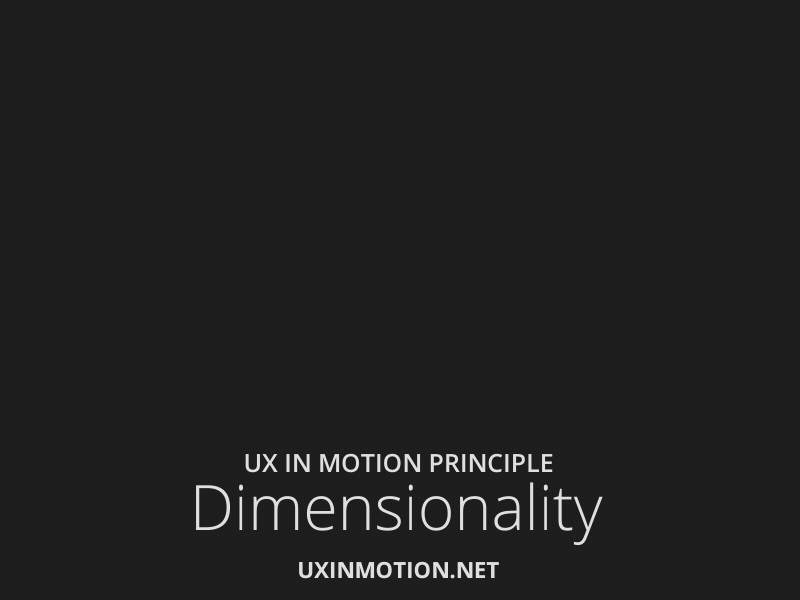
- Dimensionality
Dimensionality offers a spatial narrative framework as new objects originate and depart. Flatland non-logic can be avoided with dimensionality. This principle provides spatial origin and departure references to reinforce mental models of the user’s location in the UX space.
- Origami Dimensionalityincludes ‘folding’ or ‘hinged’ three-dimensional UI objects. This combines multiple objects into ‘origami’ structures. Hidden objects still ‘exist’ spatially though invisible. User Experience becomes a continuous spatial event creating an operating context in user interactions and the temporal behavior of the interface objects.
- Floating Dimensionality provides the spatial origin and departure of objects for intuitiveness and story narration.
- Object Dimensionality creates actual depth and form in dimensional objects. The dimensionality of objects can be experienced during real-time and non-real-time transitions. Object Dimensionality helps develop a keen awareness of object utility based on spatial locations that are non-visible.
Wrapping up with some Design Tips
Sometimes we get caught up in the cool factor of animation and don’t consider it interrupts the primary purpose of its usage. The idea is to minimize intrusiveness and add clarity to narration if you include animation and motion in your designs. As a leading UX animation company, Radiant Digital can help you ace the usability of your design.
Here are some expert tips:
- Adding the ‘pull-to-refresh’ gesture adds an arrow indicator with a downward motion to let the user know they have to slide down to refresh. Alternatively, using a ‘refresh’ button would be more intuitive.
- Keeping the user informed with subtle cues on waiting time and the background process is essential. The user’s confidence in the refresh action is directly related to its technical representation. It would be best to keep the refresh indicator spinning until the new data loads on the screen.
- Functional animation and transitions should be intermediaries between different UI states.
Ideal UX animations merge content and object interactions with feedback, notifications, and user engagement.


